By: Ryan Cooley
The Washington Commanders name is here. After a long year and a half, Washington finally unveiled its new identity. The announcement came with the new uniforms, logo, and apparel. Jason Wright stated multiple times this was still the very beginning of the rebrand and there was much left to do.
In the summer of 2020, Washington announced it was retiring the name Redskins due to the controversy surrounding racism towards Native Americans. For the next two seasons, they were known as the Washington Football Team.
Here is a breakdown of the new name, logo, and uniform.
The Name
Initial reaction to the name Commanders wasn’t optimistic. Throughout the nearly two-year rebrand, Commanders was not high on many’s lists. Wright explained the name embraces the team’s history and captures what they want this organization to represent going forward. Some fans are reluctant to agree with this statement.
Redwolves/Wolves was the fan-favorite by a significant margin during this process. However, due to trademarks issues, Washington opted to forgo this option. Hogs was another name fans wanted but possibly wasn’t popular enough to warrant it as the finalist.
Over time, people will get used to the name Commanders. Many got used to “the football team,” so I am sure Commanders will settle in eventually.
The Logo
One aspect that fans seemed to collectively rally behind was the “W” as the Washington Football Team logo. They used this as the new logo with some slight changes to fit the Commanders name better.
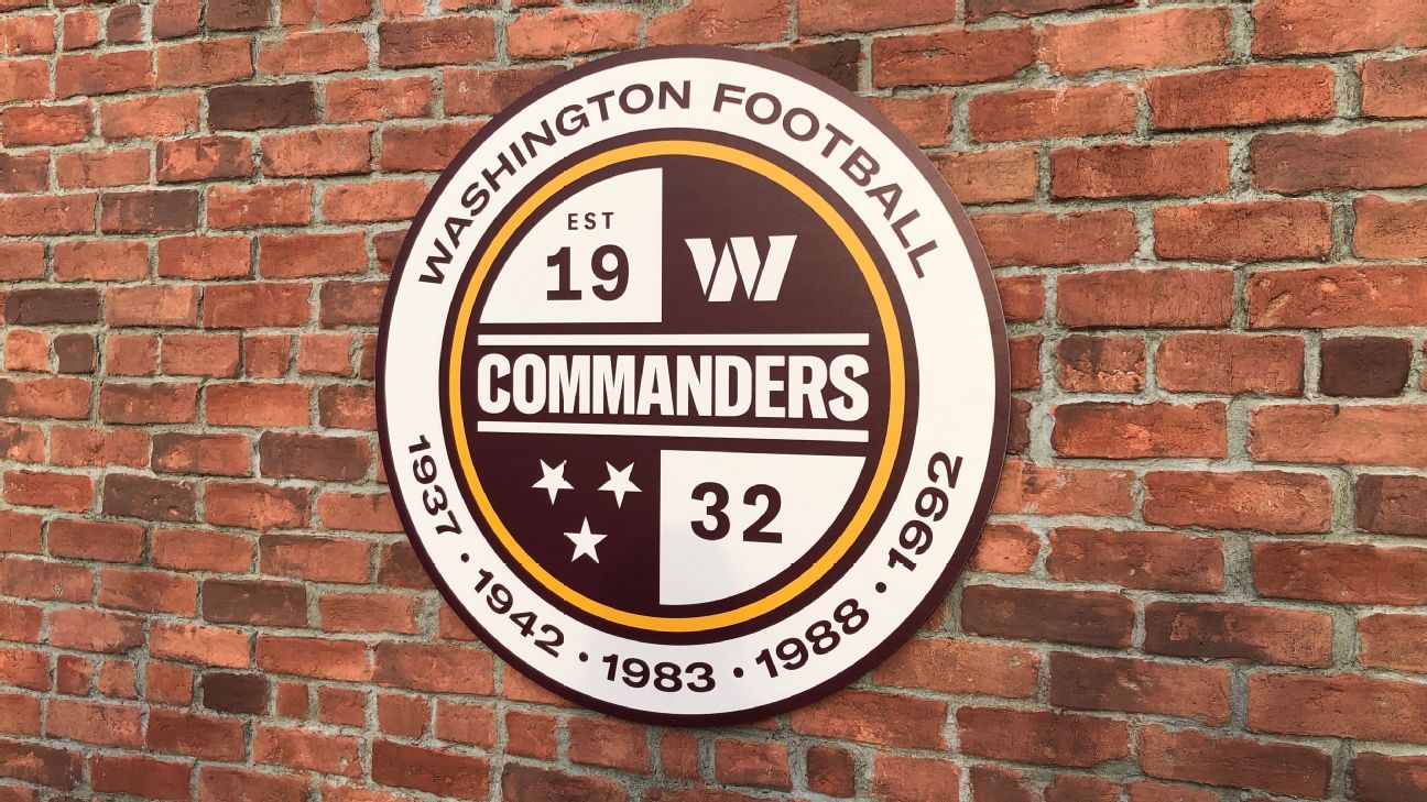
They also have the patch logo that incorporates the W, when the team was established, and the years of their championships. This logo seems forced as they try to connect the Commanders name to the team’s history. Jason Wright mentioned a potential mascot making an appearance in the coming years. There is a possibility the mascot could be incorporated in a new logo down the road.
The Uniform
A good number of fans were concerned more about the uniforms than the actual name. Immediate reactions were mixed. Some loved the home, away, and black alternate uniforms, while others wanted them thrown in the trash. The home burgundy uniforms is a much more traditional look without anything crazy. The white away uniform had arguably the most mixed reviews. Some fans loved the new modern look, while others were upset at the lack of gold incorporated in it.
The black alternate uniforms seemed well received. I believe there is too much on the jersey. One sleeve contains the D.C. flag and the other has the patch logo. The name Commanders is also offset on the chest and the collar and sleeves have a camo pattern on them. The worst part of the uniform is the W logo on the forehead of the helmet. It seems out of place and unnecessary.
Conclusion
Overall, the fans will get used to the name, uniform, and logo. I wish they had given fans more of a say in this process. Looking back now, it feels as if some of the polls and focus groups were simply for entertainment purposes only. Commanders is not the worst name that was presented as a possibility but was far from the best. I believe the uniforms could have been better. Some aspects seemed rushed and forced, mainly the black jersey. The good news is the uniforms can always be changed/altered.
It is difficult to say if they got the rebrand right as only time will tell. However, I am certain fans will eventually come around and embrace the name over time.


 NFL
NFL


Awesome and very informative article Ryan Cooley!
Great job Cousin!
Look forward to seeing more of them