By: Rick O’Donnell
Gone are the days where Apple used to make drastic changes to their product lines to lure customers into upgrading their phone. We’ve entered the minor upgrade phase but that doesn’t mean that change still can’t happen. There are a few design tweaks to the current line that could make the next iteration of the iPhone more intuitive and hopefully Apple takes note.
Functionality of the Action Button
This one is a minor tweak but can and should take more of a prominent role going forward. So far, the action button can be programmed for silent mode, focus, camera (although redundant), voice memo, Shazam, translate, magnify, and control center. Yet there’s a key feature that Apple could and should apply, Music. Okay, yes, the music controls on the Home Screen are just as easy to control, but if the camera button exists and the action button can control camera, then it can control music as well.
Realistically, the action button could take up the functionality of the Digital Crown on AirPod Max and Apple Watch. No, they shouldn’t add a crown to the iPhone but the Action Button could be used as a double tap to skip songs, or triple tapped to go back. If that functionality is challenging with a physical button for them, although I don’t see how, then a simple tap to go forward, hold to go back could work. It might not be a game changer but a quick tap button that allows you functionality away from your screen time scrolling would be a nice tough.
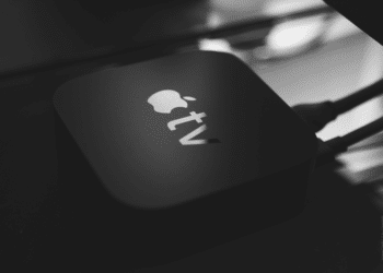
Or better yet, add the remote feature to the Action Button. Remotes are getting smaller these days and harder to keep track of. Who wants to pull out the Find My app every time they can’t find their remote. Wouldn’t it be just as simple to not have to go through multiple steps and the control center to bring up the remote with a click of a button? Tap to play on the Apple TV, or hold to skip to the next episode? Sign me up.
Eliminate the Physical Volume Buttons
With the addition of the camera button to the iPhone, it really kills of the need for protruding physical buttons. With a simple tap, you can pull up your camera, a hold brings up Visual Intelligence, and a scroll up or down controls the camera zoom. For a company that is so heavily influenced by the inclusion of music and iTunes, couldn’t we make the Volume Button the same as the camera buttons? Wouldn’t it be nice to click to bring up iTunes and hold/swipe to control the volume of your phone? Or tap to bring up Music, scroll up or down to skip songs or go back? Apple has all the tools to make customization better on the iPhone but they need to lean into these design changes.
Better Sports App
Okay this is more iOS based than a physical design change, but if Apple is going to have a designated sports app then it needs to go all in. One of the best features of the app is to be able to pull up the games at the click of a button. If you’re score watching on the Sports app you can click “Get on Apple TV”. However, Apple needs to take this one step further and include that functionality into their News app as well. If you’re following a team on the Sports app, there should be a jump to news button as well. Have you ever been following along with your favorite team and realized your favorite player has zero fantasy points for you? Why are they not getting me any points? To be able to jump to the news and find out with a click of a button could be an easy fix and you’d realize they were out injured.
There are so many minor tweaks that Apple is overlooking that could easily lead to a better product in the hands of their consumers. While they seem to have run out of ideas, the world is ever-changing and accessibility needs to be more customizable based on the daily lives of users. What are some more features you’d like to see change with the next iPhone?


 NFL
NFL


