

 NFL
NFL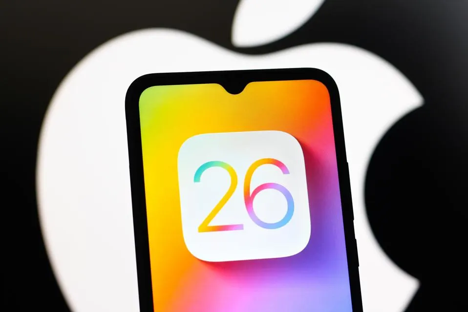
By Rick O’Donnell
New year, new iOS for Apple. It’s like clockwork. As many places have reported, including Apple, this year is one of the biggest design changes in a while as well as a rename. The iPhone maker changed from a sequential iteration naming system to an annual numbered system similar to car models. Luckily, naming their operating systems wasn’t the only significant change they made.
With the new iOS, it looks like Apple finally took a bit of a swing instead of small incremental changes. While everyone is promoting new features to show off function, they’re often forgetting just how sleek the new design is. With the next operating system, they introduced what they’re calling Liquid Glass. I was able to download iOS 26 and here’s what you can be excited about:
First and foremost, Liquid Glass didn’t wow off of the initial design until I started exploring a bit more on the phone as well as other devices. It should be noted, that this introduction is simply a design and aesthetic choice. When Apple releases new visuals, they tend to have something in mind for their hardware as well, but I guess we’ll have to wait for their keynote later this year to see it to its full effect.
Back to Liquid Glass. What really stands out here is the minimalist approach it brings to things. Just by adding a bit of transparency to controls and menus it feels as if your screen has cleared up a bit. On day-to-day things, it just looks like a cool visual effect that you get used to. When you really start to notice it’s use is when you’re streaming from devices.
Take the Apple TV, for instance. Before the tvOS 26 update, whenever you turned up the volume, the volume bar took up a small, yet distracting part of your screen. Now, with Liquid Glass, the meter is more transparent except for the volume level. Yes, it’s a very small detail, but it is much more aesthetically pleasing in function. The same can be said of the rest of the menus.
As far as other design choices, one thing many sites aren’t pointing out is yet another small feature that changes the way we look at screenshots. On the old operating systems, whenever you screenshot from an iPhone it would have the usual squared-off edges. In iOS 26, whenever you screen grab now, you’ll see the rounded off corners showing the edge-to-edge full-screen look of your new photo. Then when you crop and adjust it reverts back to squared off again.
Another small tweak that I absolutely love now, is the redesigned Lock Screen. One of the simplest changes makes all the difference to me. The ability to resize your time setting on the Lock Screen to either a custom size or adaptable to the photo in the background, it just makes yet another aesthetically pleasing appearance. It’s clear that iOS 26 is all about design.
The majority of what Apple has done with the new operating systems is designed to declutter your screen. It softens the controls and makes them less distracting once you’re used to them. There have been reports that the new Liquid Glass makes things hard to read. So far I have not run into these problems, but people need to understand, this is also just a beta, not a final product. I’ve tried to replicate these complaints by changing settings including turning up and down brightness. I have yet to run into it. If you’re a fan of customization and aesthetics, the unified look of iOS and the rest of their operating systems will be for you.
Overall, I think the new iOS 26 will be a hit. It adds a bit of flare and more customization to the iPhone in a way that will feel like you’re actually upgrading your phone when the next round comes out, something Apple has failed to do in the recent past.
Check back for more updates as we dive deeper into some more of the new OS.


